Orange Signal Glitch Portrait Poster
Use the uploaded photo as the ONLY identity reference. Preserve the person’s exact recognizable face, including facial structure, face shape, eyes, eyebrows, nose, lips, jawline, chin, skin tone, natural skin texture, hairline, and distinctive features. Do not copy or resemble the reference model’s identity. Do not beautify or alter the user’s facial anatomy.
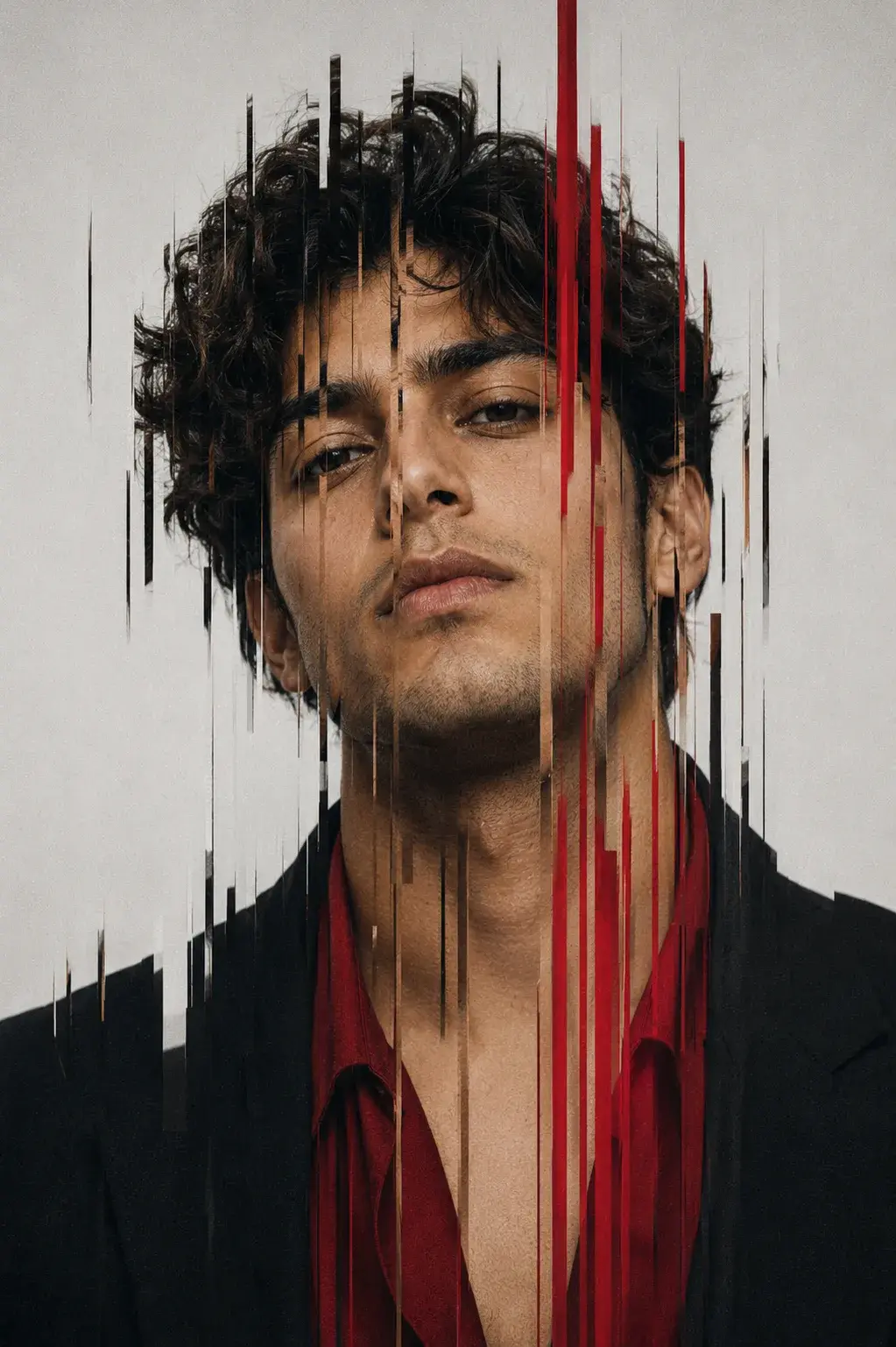
Recreate the supplied reference image as a premium photorealistic editorial poster titled “ORANGE SIGNAL.” The uploaded person should replace the reference subject while keeping the reference’s expression, emotion, gaze, head position, pose, composition, clothing, lighting, and visual style.
Create a vertical 4:5 composition with the subject framed from the upper chest upward, positioned slightly toward the center-right. Reproduce the reference’s calm, serious, slightly mysterious expression with closed relaxed lips and a direct, intense gaze toward the camera. Keep the head upright with the same subtle three-quarter orientation as the reference.
Dress the subject in a minimal black high-neck/turtleneck outfit. Keep their natural hairstyle/identity but recreate the reference’s dramatic horizontal wind/motion-blur effect, with fine dark hair and facial streaks extending strongly toward the left.
Across the eye/upper-face area, add a wide burnt-orange/red horizontal signal band spanning the entire image. It should contain layered scan lines, scratches, fragmented streaks, and subtle digital interference while keeping the eyes recognizable and visible through the distortion.
Use a warm ivory/aged-paper background with subtle grain, dust, fine gray construction lines, registration crosshairs, dotted technical marks, and minimalist editorial graphics.
Recreate the typography and placement:
- Upper-left: “INTERFERENCE REVEALS WHAT MATTERS”
- Below: “FILTER THE NOISE FOCUS WITH INTENTION”
- Below: “A VISION SHARP ENOUGH TO CUT THROUGH”
- Lower-left: huge condensed “ORANGE” in orange-red and “SIGNAL” in black
- Right side: “CLARITY IN MOTION MEANING IN CONTROL”
- Lower-right: “2026” with small orange accents and technical crosshair
- Bottom: small barcode-style graphic
Use sophisticated Swiss editorial typography, restrained asymmetrical layout, realistic studio lighting, natural skin detail, subtle film grain, archival paper texture, and high-end fashion-campaign aesthetics.
PRIORITY: Uploaded photo = identity. Reference = expression, gaze, head pose, body pose, composition, clothing, graphics, lighting, colors, and style. Never let the source photo’s original expression, gaze, or pose override the reference. No identity change, generic AI face, excessive beauty retouching, cartoon look, extra people, or distorted anatomy.














%22%2F%3E%3Cpath%20d%3D%22M24%2011L34%2015V23C34%2029.5%2029.7%2035.3%2024%2037C18.3%2035.3%2014%2029.5%2014%2023V15L24%2011Z%22%20fill%3D%22%23FFFFFF%22%20fill-opacity%3D%220.15%22%20stroke%3D%22%23FFFFFF%22%20stroke-width%3D%221.8%22%20stroke-linejoin%3D%22round%22%2F%3E%3Cpath%20d%3D%22M19%2024L22.5%2027.5L29%2020.5%22%20stroke%3D%22%23FFFFFF%22%20stroke-width%3D%222.2%22%20stroke-linecap%3D%22round%22%20stroke-linejoin%3D%22round%22%2F%3E%3Cdefs%3E%3ClinearGradient%20id%3D%22bg_shield%22%20x1%3D%220%22%20y1%3D%220%22%20x2%3D%2248%22%20y2%3D%2248%22%20gradientUnits%3D%22userSpaceOnUse%22%3E%3Cstop%20stop-color%3D%22%23059669%22%2F%3E%3Cstop%20offset%3D%221%22%20stop-color%3D%22%2310B981%22%2F%3E%3C%2FlinearGradient%3E%3C%2Fdefs%3E%3C%2Fsvg%3E "Vivek Sharma portrait")