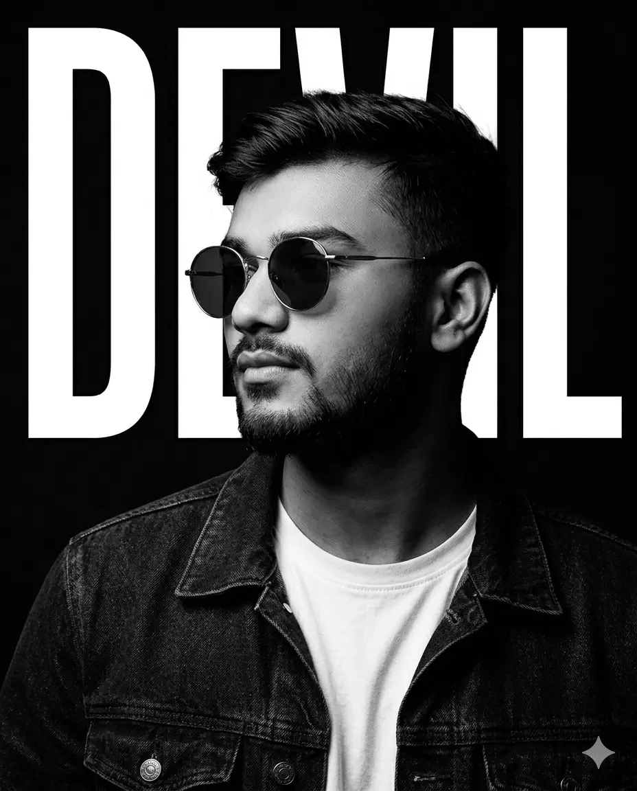
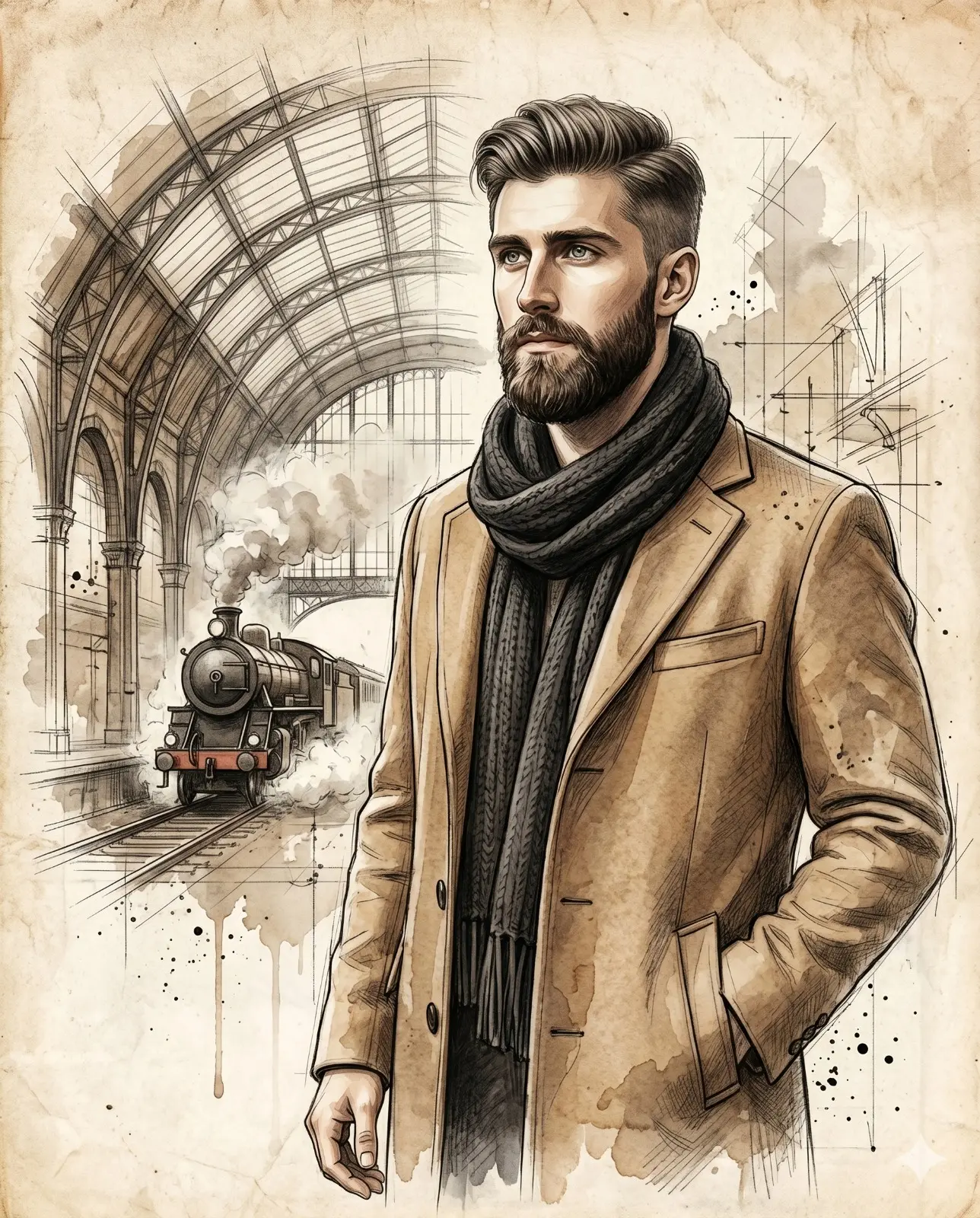
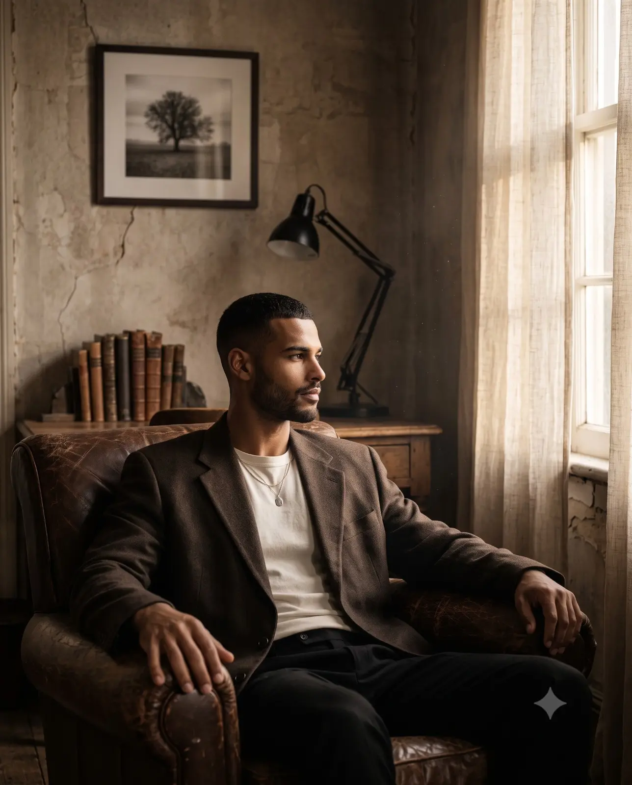
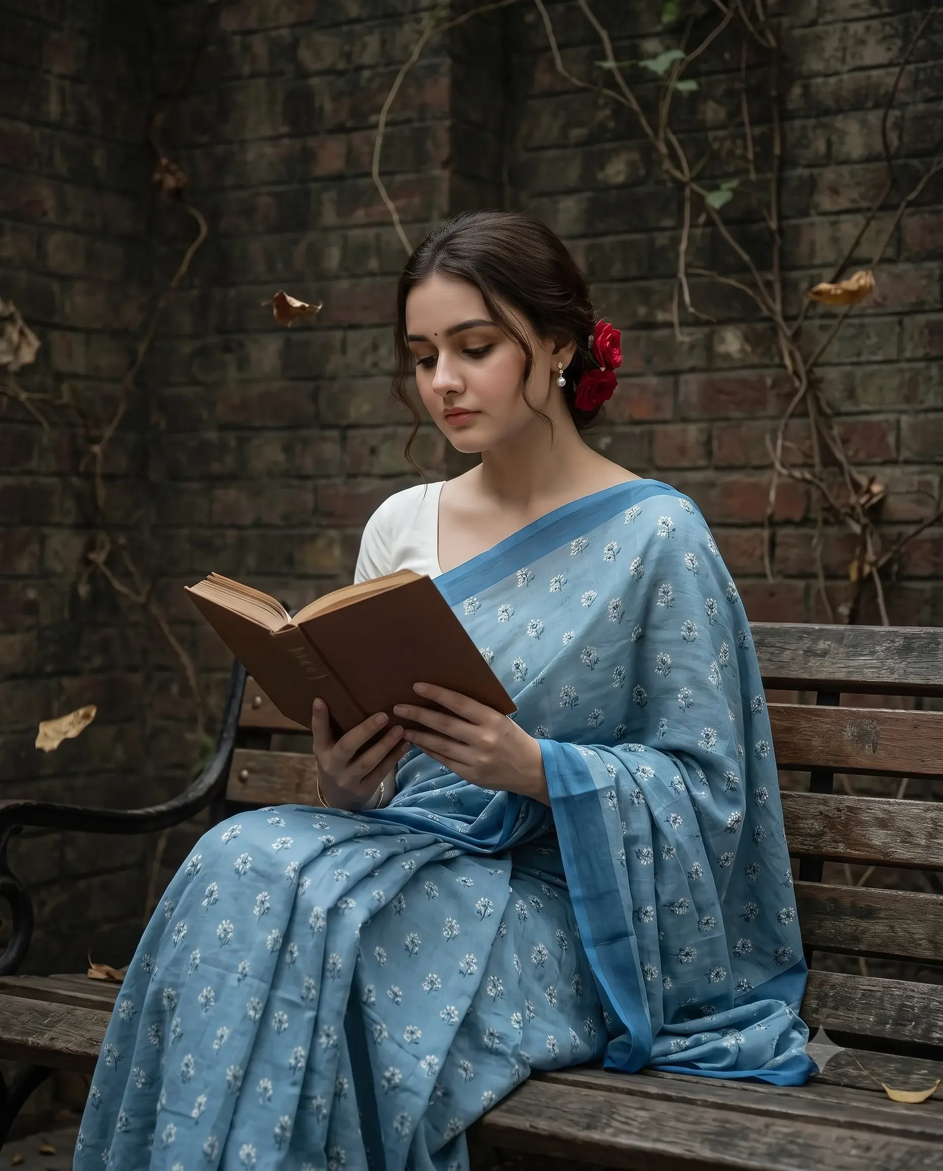
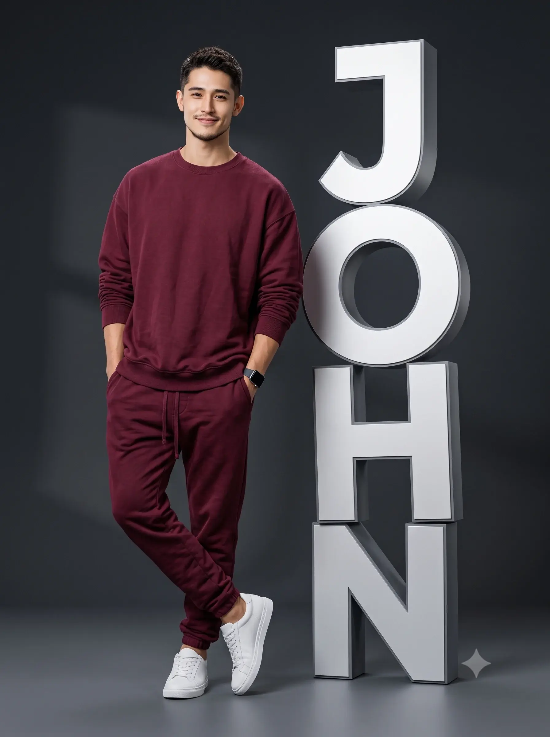
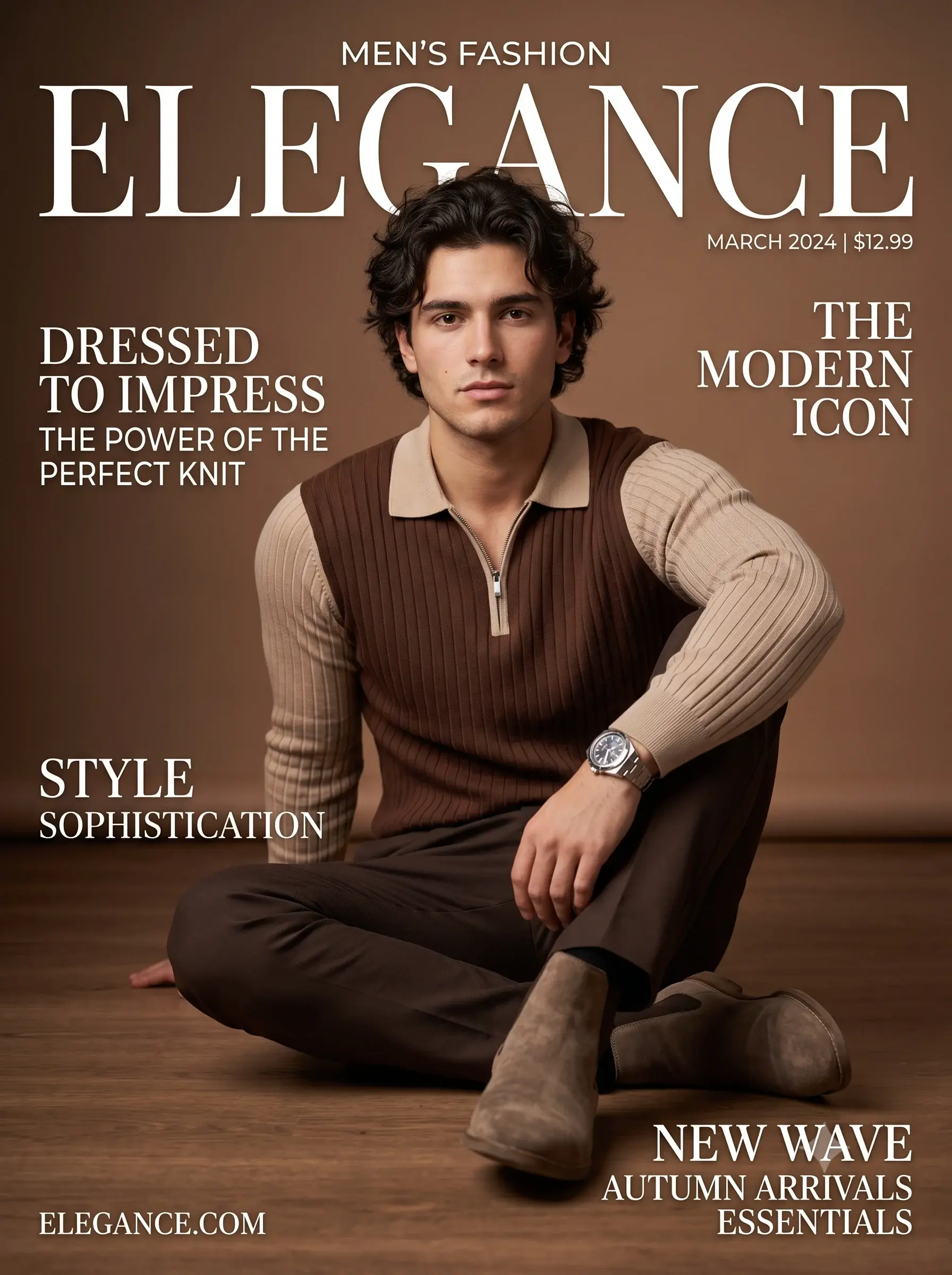
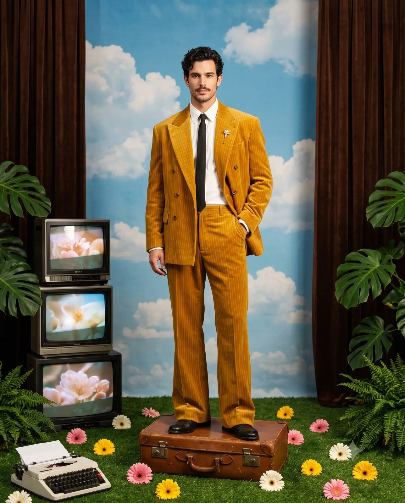
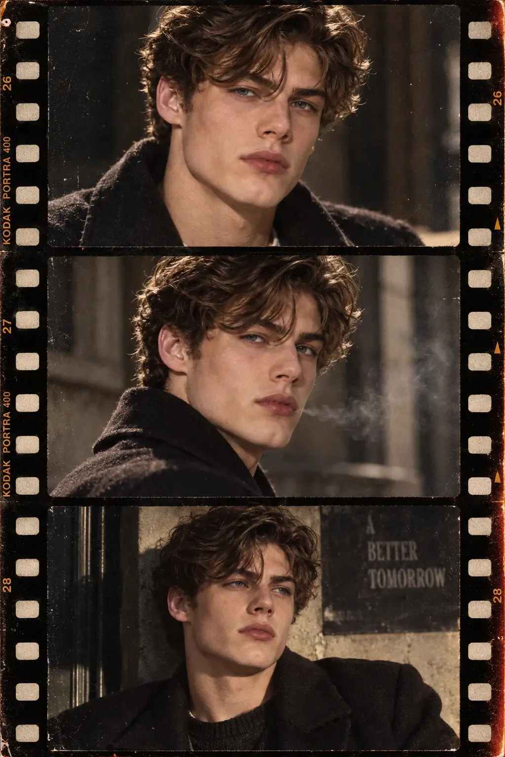
Cut & Paste: Editorial Collage
Transform my uploaded image into a premium experimental magazine collage poster inspired by underground fashion editorials, vintage cut-and-paste magazines, photocopied zines, and contemporary graphic design.
CUSTOM TEXT — REPLACE THESE BEFORE GENERATING
- Main headline: “[YOUR MAIN HEADLINE]”
- Secondary phrase: “[YOUR SECONDARY TEXT]”
- Small editorial label: “[YOUR BRAND NAME / LOGO TEXT]”
- Optional date or issue number: “[DATE / ISSUE NUMBER]”
COMPOSITION AND LAYOUT
Create a dense, asymmetrical editorial collage using the uploaded person's photograph as the main visual subject. Cut the portrait into multiple photographic sections and combine them with overlapping paper fragments, cropped close-ups of the eyes and lips, smaller repeated portrait images, torn newspaper clippings, photocopied textures, and irregular rectangular frames.
Arrange the elements like a professionally art-directed independent fashion magazine cover. Use deliberate overlaps, hard crops, layered paper edges, slightly misaligned print layers, rough cutout silhouettes, handwritten marks, stars, arrows, underlines, and small decorative symbols.
TYPOGRAPHY AND TEXT PLACEMENT
Make “[YOUR MAIN HEADLINE]” the dominant readable headline. Use oversized bold condensed sans-serif lettering or heavy vintage editorial typography. Position it across the upper-left or lower portion of the composition, allowing selected letters to interact with the collage layers without obscuring the main subject excessively.
Place “[YOUR SECONDARY TEXT]” in a contrasting typeface, such as a bold serif, italic magazine font, or compact uppercase lettering. Integrate it into a separate paper strip or open area of the layout.
Place “[YOUR BRAND NAME / LOGO TEXT]” as a small but clearly readable masthead or signature near the top edge, bottom corner, or on a paper label. It should look like intentional editorial branding, not a randomly generated watermark.
Place “[DATE / ISSUE NUMBER]” in tiny magazine-style text near a corner. Add restrained microtypography and handwritten annotations around the collage to create an authentic printed-publication feel.
COLOR AND MATERIALS
Use a carefully controlled palette of crimson red, warm ivory, black, charcoal grey, and occasional muted beige. Combine matte paper, aged newsprint, photocopy grain, halftone dots, scratched ink, rough paper fibers, subtle print misregistration, and authentic cut-and-paste edges.
The portrait should remain photographic and recognizable, with natural skin texture and believable lighting. Blend the photographs into the paper composition instead of making them look like floating stickers.
FINAL ART DIRECTION
High-end experimental graphic design, underground fashion magazine, rebellious editorial art direction, strong typographic hierarchy, visually balanced chaos, sophisticated negative space, tactile printed textures, crisp photographic cutouts, intentional asymmetry, professional poster composition, high-resolution finish.
IMPORTANT TEXT RULES: Reproduce the four custom text fields exactly as written inside their brackets, replacing each bracketed field with the user's supplied wording. Do not substitute unrelated slogans, misspell words, invent brand names, or add random readable text. Keep the headline, secondary phrase, masthead, and date visually distinct.
Avoid generic AI poster templates, excessive stickers, illegible headline typography, duplicated facial features, distorted faces, fake corporate logos, watermarks, and overly smooth plastic-looking skin.